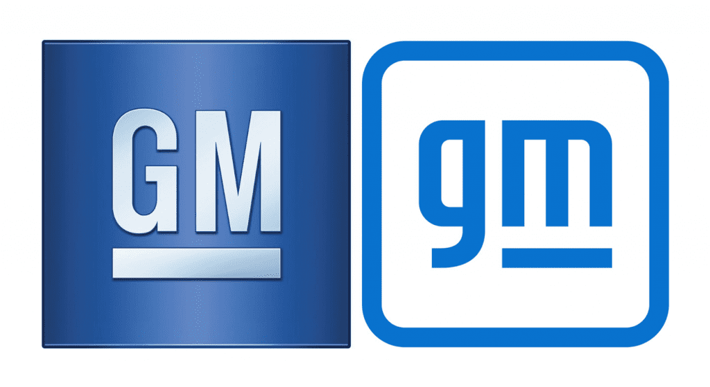
General Motors has made the first significant logo redesign since 1964. The new logo is part of a marketing campaign, titled “Everybody In.” The automaker is really pushing towards a larger electric vehicle market. With that idea, they changed their logo to better represent their electric vehicle stance.
Looking at the new logo you can see that the two letters, “GM” have been made lowercase. The “m” is supposed to resemble an electric plug. The blue color is to signify clean skies. This refers to the push for cleaner emissions.

While Chevrolet cars like the Bolt EV have been around for a few years Chevy has quite a few other EVs in the works. The Hummer EV and the Cadillac Lyriq are two cars the manufacturer is planning on creating. The Hummer EV will have a starting price of $100,000. While it might be out of the price range of most we have to admit it is a pretty cool ride.
Most logos on Chevrolet vehicles will stay the same. Although corporate offices, GM’s website, and other corporate-related assets will start featuring the new logo. What do you think about the logo? Let us know in the comments below!

